Your online store is your best way to convert visitors into customers so what design elements and features should you employ to boost those conversion metrics? The easier and more streamlined the purchasing experience for your customers, the more chance you have of capturing their shopping dollars. It is a journey that starts as the potential customer simply being a website visitor, and from here sales funnels and persuasive as well as informative copy will turn visitors into customers.
The site design has to be clean and well laid out for users to navigate and you need multiple ways for them to pay. If it is time to update your website’s design, browse through this link for web design inspiration and get some great templates and ideas. Here we will run through 6 strategic design tips to get more visitors to convert.
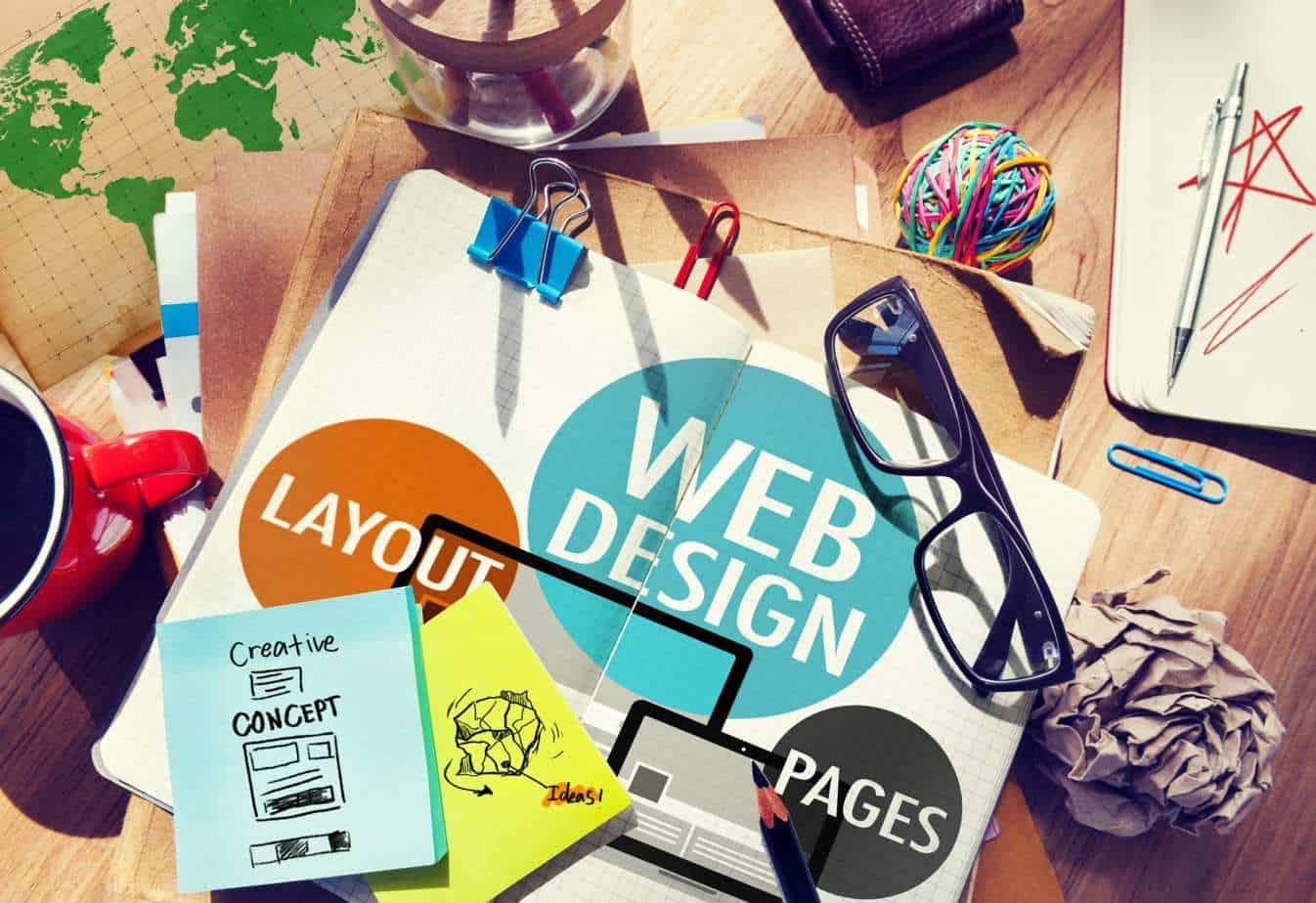
Clean and Simple to Navigate
We cannot stress enough that website design should focus on usability. Can they find the information quickly? Can they learn about your business and trust it enough to transact with you? Sometimes designers take over to create beautiful sites, but they miss out on essential functionality that makes it too difficult to navigate through the sales funnel.
Strong CTA Buttons in the Right Places
CTA buttons are Call to Action signposts on your website that indicate to the customer where to find more information, find pricing and checkout. These should be in colors that contrast with the background of the site and should have simple text that online users are used to, such as, “BUY NOW”, “ADD TO CART” and “LEARN MORE” and put them in prominent locations where your key selling points and information are.
Using the Rule of Thirds
The Rule of Thirds dictates that the most noticeable areas on an image or page are the 4 intersections of a grid if you were to dissect a page into 9 blocks. To do this take a page and draw 2 vertical lines and 2 horizontal lines to create 9 equal-sized blocks (See the image below). Where they intersect, you have 4 spots that have the most attention. See this example where Kissmetrics places their strapline at the top left spot and their call to action button right on the bottom left spot to maximise interest and conversion.
The F Layout
The F layout is another design technique that plays into where the eyes of the reader look on a page. Their principal focus will be the left of the page, along the top horizontally and along towards the centre halfway down the page giving you an F layout.
To take advantage of this common user behaviour, put your most important information, links and CTA’s on the F and the less critical information like cookie policies or white space to the right or bottom.
On-site Search and Menus
Every customer that arrives at your website comes through search. Once they arrive, the most common way customers navigate is by searching for information within your site. This type of searching within your site is called “Onsite Search”. The eConsultancy study showed that 30% of visitors perform on-site searches and are twice as likely to buy as people who haven’t used on-site searches.
Each of your customers is unique in their search behaviour and what information they are seeking, so the best way to help each one is to have a robust and intelligent search function. You can also create sub-menus so that you can categorise each option under one parent category. Sub-menus are essential for ensuring that your website can easily categorise the most important content and maintain a clutter-free site.
AI Chatbots
By using a chatbot, you’ll be able to engage with customers 24/7, improving the user experience on your website and increasing sales. They provide a way to reduce customer waiting times and the resources you need to respond to each customer. Using artificial intelligence and business process automation, they can handle every kind of enquiry, including sales, support, and complaints. You can program how your website will respond to the customer depending on their actions on the screen giving them instant responses and information and for queries that don’t have an answer in the database, a ticket is raised that goes to a human to respond to.
Conclusion
Navigating through a website can be challenging for customers and can feel overwhelming. The 6 tips in this article will help you design a website that improves usability and ultimately, helps customers accomplish their goals.
Visitors come from advertising campaigns and SEO, not just from search engine results pages. It’s what you do once they arrive that will decide if they remain a browser or turn into a customer. Therefore, the design and purpose of every page on your site should be to engage the visitor and give them a reason to buy.