How to Create a Customer Newsletter Subscription Form
E-mailing helps to solve several problems that are important for the seller at once. Firstly, with the help of email, the necessary information is conveyed to users: about discounts, special offers, sales, and so on. Secondly, the mailing pushes potential customers to perform a targeted action. After receiving an email, a person is more likely to make a purchase, add the product to his Favorites, or leave a review. To deliver an email to each user who is interested in the company’s products or services, leave a newsletter subscription form on the site. You can find out how to do this at https://selzy.com/en/features/email/subscription-forms/, for example. Also, when working, consider the recommendations of experts in the field of Internet marketing.
Where to Place the Newsletter Subscription Form
It is important that the form organically fit into the design of the site. At the same time, it is important to make the questionnaire easy to fill out so that users do not take too long to sign up. Consider the following points when choosing a form location.
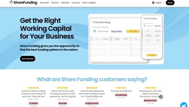
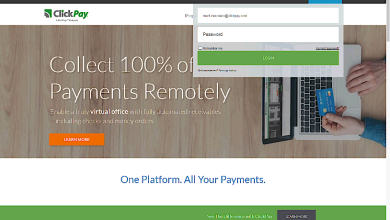
- Space for the subscription must be allocated. Try highlighting the form as a separate window using visual content (such as a photo with an arrow).
- The questionnaire must be in a conspicuous place. If a form is easy to miss, it definitely won’t work.
- Through molds are highly efficient. The place to subscribe must be displayed on each page, then users do not have to open all sections of the site and spend a lot of time.
- There should be visual guides next to the questionnaire. These can be icons, arrows, and other indicators that will lead users to the desired field.
- You can use multiple forms. For example, place a profile on the page and in the footer at the same time. If a person closes the pop-up window, they will always have the option to leave the contact address elsewhere.
It is important that customer activity can be tracked on each form. Then you will understand which option works best and you can use the most effective options for collecting email addresses for the subscription.
What to Write in the Subscription Form?
It is important to indicate why it is beneficial for users to subscribe to the newsletter from company. Remember: there are thousands of “unique”, “profitable” and other offers from competitors on the Internet. Your offer should look realistic and point out specific benefits to subscribers. In addition, there are a few tricks that you should use in your form body that will improve the efficiency of collecting email addresses.
- Contrasting CTA buttons. They always attract attention and clearly explain what customers need to do (if it’s hard for you to design a button on your own, conduct a preliminary test).
- Information about the frequency of distribution. If you send letters at a certain time, be sure to let potential subscribers know about it. Check at least the days of the week, or specify how many messages a person will receive each week (this may be important for some recipients).
- Lists instead of descriptions. If you offer customers multiple subscription bonuses at once, arrange the information in the form of a list. This will make it easier for people to understand what they are interested in in your offer.
- Exclusive offers. Your task is to stimulate customers and get them to leave their email addresses in the form. Practice shows that subscribers are most motivated by bonuses for completing a target action (for example, free e-books or checklists).
Pay special attention to the visual design of the form. It is known that well-chosen pictures and videos attract users, so they are more willing to leave contact information on the site. It is only important to make sure that the visual content does not distract from the subscription form, but, on the contrary, draws the attention of site visitors to it.
What Customers Fear and How to Get Rid of Their Fears


Most potential subscribers fear that their email addresses will fall into the wrong hands. No one wants to receive annoying advertising messages and similar content. To allay the fears of customers, demonstrate to them in advance what kind of letters they will receive by subscription. If a person sees potentially interesting and useful content, he will be much more willing to subscribe.
Try to look at the form through the eyes of the client. In this case, you will see little things that annoy people and prevent them from leaving their email addresses. For example, many people do not like the captcha that must be filled in before submitting the form. Therefore, remove such code from the site so as not to annoy customers.
Try to make sure that the questionnaire contains a minimum of fields. Nobody likes filling out long forms. In addition, users are embarrassed that they have to provide too much personal information. If you need to ask dozens of questions, break the process of filling out the questionnaire into steps. Also, make at least some of the fields optional. This will appeal to people who do not like to spend a lot of time on third-party activities on the Internet.
Top 4 Subscription Form Tips
Even if you have a subscription form on your site, check out these tips from professional marketers. They may help you increase your sales.
- Be sure to follow the visual design of the questionnaire. All fields must be even and neat, and the CTA button stands out from the general background and immediately attracts attention.
- Don’t forget about the privacy policy. Even if you think that users will not read this information, be sure to leave a link to it next to the subscription form. After all, it is the privacy policy that tells how the site works with personal data.
- Don’t force clients to enter the same information twice. Even if the user subscribes to several mailing categories at once, allow him to fill out the questionnaire only once. This will significantly increase the number of subscribers who do not want to spend time re-entering personal data.
- Test the form beforehand. Before offering a questionnaire to potential subscribers, try it out yourself. So, you will be able to choose the most convenient and visually attractive option.
Remember: the subscription form does not have to stay in one place. Experiment with the location and design of the questionnaire, and then you will find an option that will be truly effective.